
Redesigning house-buying process for confident decision-making
My Role
Research, UX, UI, Brand
Figma
Tools
Duration
8 Weeks
(Part-Time)


Problem Space
As my friend was excited to buy their first home, but that excitement quickly turned into frustration. As 82% of first-time buyers in the UK, they struggled with fragmented real estate data, no predictive insights, and a lack of personalized guidance. Every search led to more confusion, making it impossible to feel confident in their decision.
They just wanted a clear, reliable way to navigate the market—one that didn’t leave them guessing. But with no interactive tools or tailored recommendations, every step felt like a gamble and this is when I came up with a solution that narrowed down the problem space to help first-time home-buyers like my friend to make more confident decisions.


The Approach
I chose the Double Diamond method for developing Dwello because it provided a clear, structured approach to navigating the complexity and ambiguity of the home-buying experience for first-time buyers.
This framework helped me deeply understand user frustrations—like fragmented data and lack of guidance—while allowing me to explore, refine, and test solutions that truly address their needs. It ensured a user-focused, insight-driven, more confident and empowering home-buying experience.


The Outcome
Through user interviews and testing, I evaluated my prototype before development. Those who initially felt frustrated and overwhelmed with home-buying reported feeling much calmer and more confident. The solution showed promise in transforming their experience, making the process clearer, easier, and more empowering.
The Process


Discover
Define
Ideate
Develop

Deliver

Discover
Secondary Research
I started the project by exploring first-time homebuyers' relationship with real estate and their decision-making behaviors in the United Kingdom. To gain a broader view of the problem space, I gathered reliable statistics from quantitative research and studies, uncovering key challenges they face in the home-buying journey.
44%
82% is a significant number of people who struggled during their home purchase the first time, which to me was quite surprising coming from a developing country, as I was expecting the United Kingdom to have a much easier and more convenient process to complete their purchase of property.
People are postponing their home-buying during eligibility.
82%
41%
First-time homebuyers are frustrated with the complex buying process.
First-time buyers struggled with mortgage options.
Assumptions


Hypothesis
I believe first-time homebuyers feel overwhelmed and face decision-making delays due to fragmented real estate data, lack of predictive insights, and untrustworthy sources. I will validate this when two out of three user interview respondents confirm experiencing anxiety, distrust, and hesitation in their home-buying journey.
Primary Research
For my primary research, I conducted user interviews with first-time homebuyers. They shared frustrations about eligibility checks, time-consuming house searches, poor communication with agents, and difficulties understanding paperwork, highlighting key pain points in the home-buying process.


Anxiety & Agitation Level
Affinity Mapping
After synthesizing user interview data through affinity mapping, I selected the most compelling theme, which encapsulated the most critical pain points for first-time homebuyers, ensuring a focused and impactful design approach.
Most Compelling Theme
Efficiency & Decision Making Challenges
How Might We empower first-time homebuyers with a personalized property search experience that simplifies eligibility checks, enhances guidance, and improves communication, enabling them to navigate their options with confidence?

Define
Persona
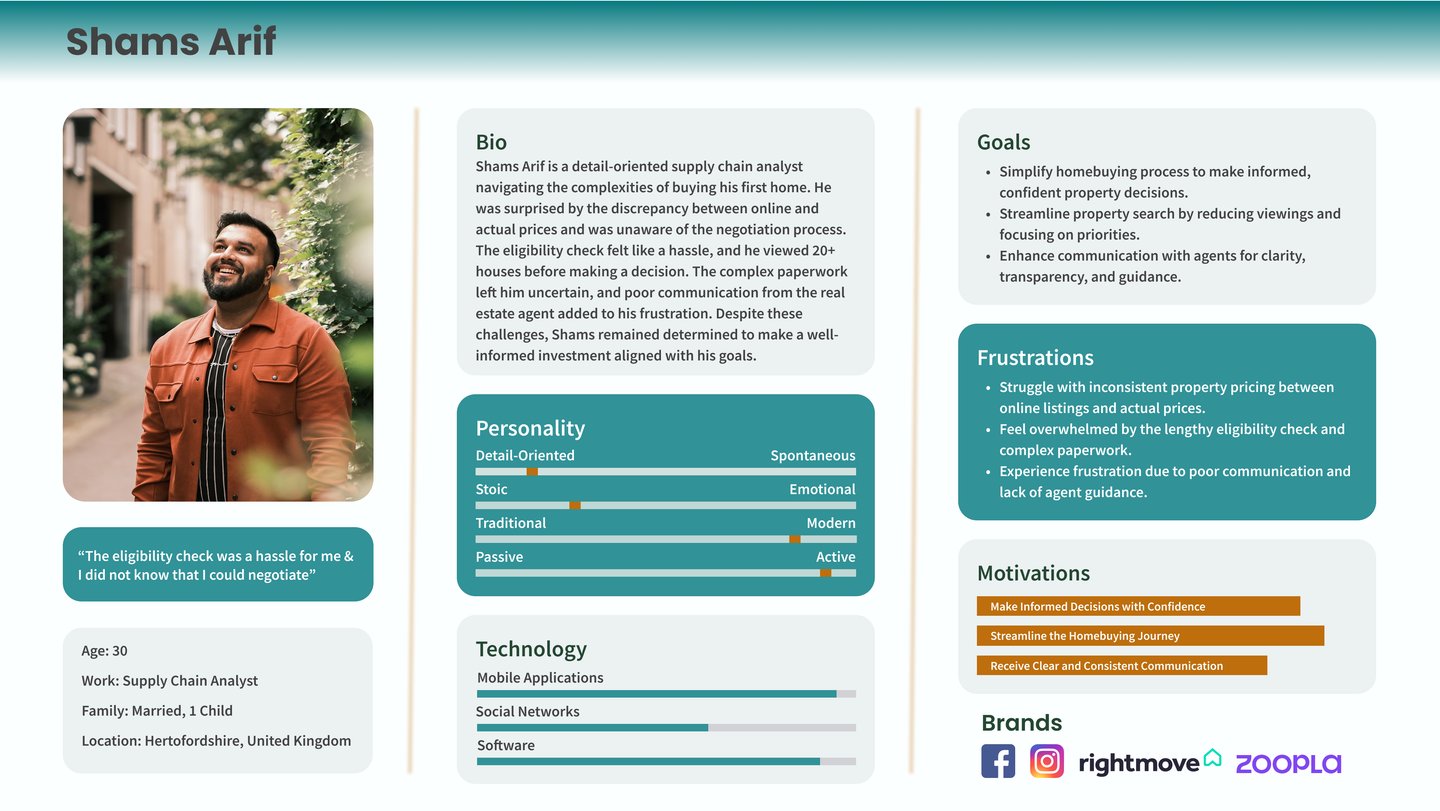

Developing a user persona to capture key frustrations, motivations, and inform design decisions effectively.
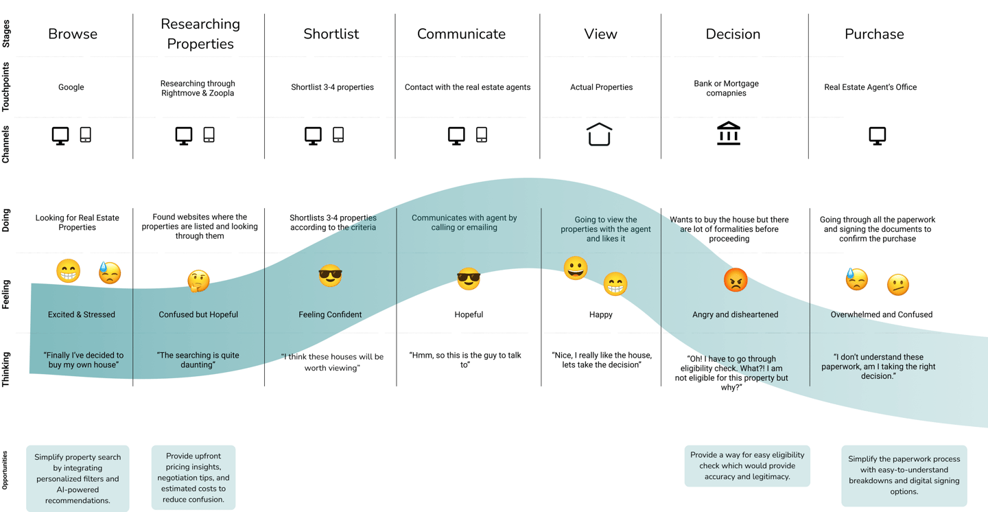
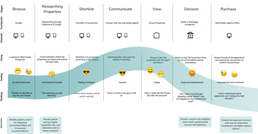
Let's map Arif's Experience to explore specific motivations, frustrations and behaviours to identify areas of opportunity.
I created 44 user stories and grouped them into five epics. I selected "Simplifying the Homebuying Process with Clarity and Confidence" as the primary epic, as it closely aligns with my How Might We question. This epic addresses key user frustrations, supports their goals, and empowers confident, informed decision-making throughout the journey.
User Stories


Ideate
Even though I am following Double Diamond’s 4Ds, I also incorporated an ideation phase where I ideate to sketch a unique solution, keeping in mind Arif's persona aligned with the task flow. Let's have a look at the primary task flow.
Primary Task Flow

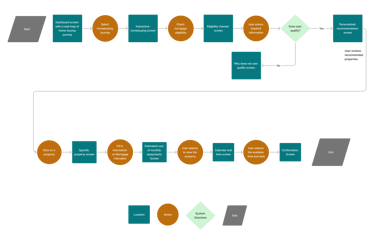
Based on the primary epic, I designed a task flow to demonstrate the solution for Arif.
Sketches
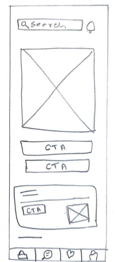

Home Screen
Property Guidance Screen
Let's take a look how this primary task flow will would look like an application. After exploring multiple solutions, the following were chosen to be the best possible solution sketches for the application.
Eligibility Check Application Form
If Arif want to save the form in the middle of filling up.
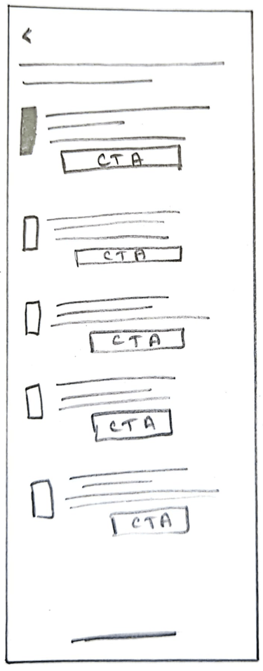
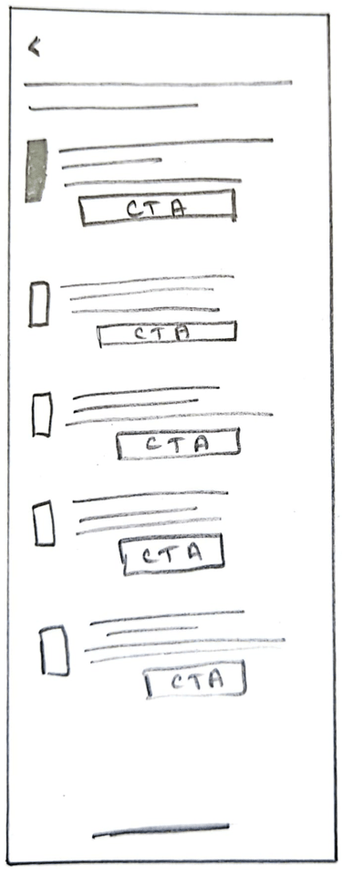
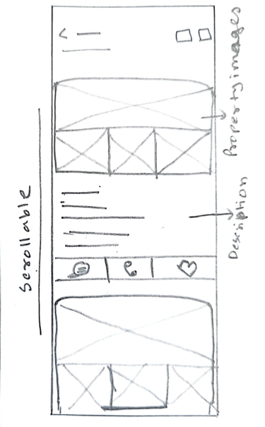
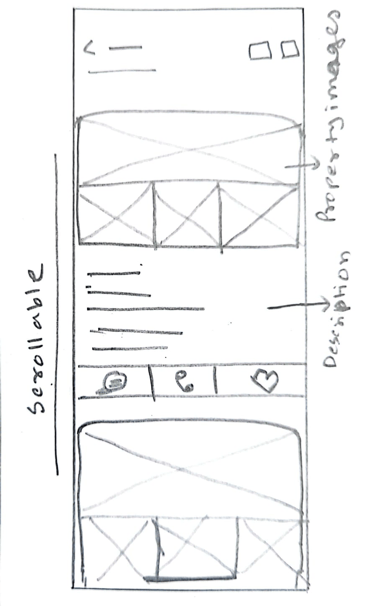
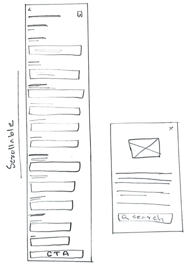
Personalized property listing screen which is scrollable
Property Images.
Property Description
Mortgage Calculator
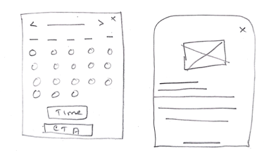
Date Picker
Property Viewing Confirmation Modal
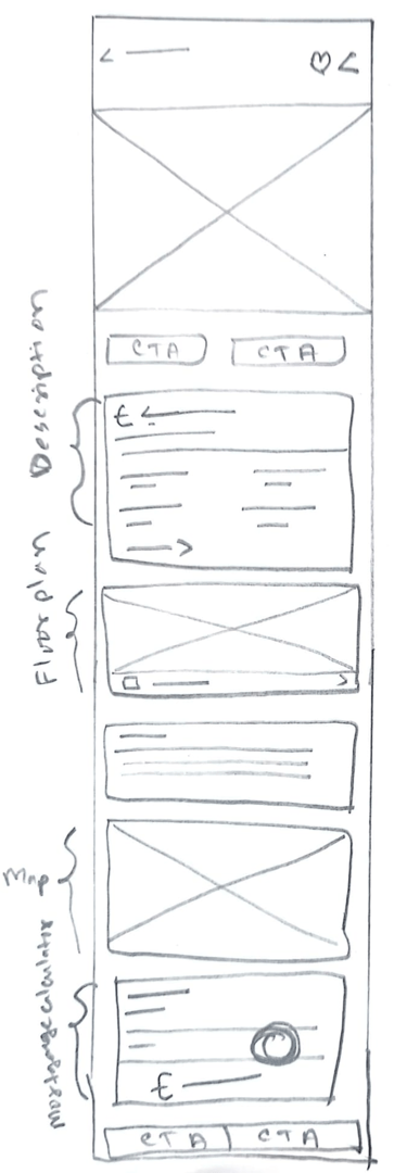
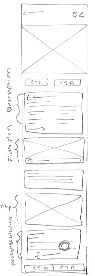
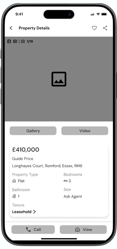
Specific Property Screen

Develop
Time to Wireframe
After completing the solution sketches, I translated them into mid-fidelity wireframes in Figma to build the initial prototype.

User Testing
Conducted two user testing rounds, prioritized feedback using a matrix, and refined the design to develop the final prototype.
Version 1
Version 2
Version 3
Remove image, make Home Screen clearer.
Add multiple ways to search properties and prompt eligibility check before browsing homes.
Add a call to action button, for example "Search" in the loan amount confirmation screen.
Change the home purchasing guidance screen layout.
Make the verification of document modal into a Screen.
The guidance screen layout was changed.
Divided the eligibility checker application form, adding a progress bar to inform the users.
Added a "Searcg in the loan amount confirmation screen.
Brand Development
I chose five keywords based on my user persona’s needs. These guided a mood board exploring visual elements to ensure the design feels clear, warm, and reliable for overwhelmed first-time homebuyers making important decisions.
Trustworthy
Modern
Approachable
Professional
Comfortable
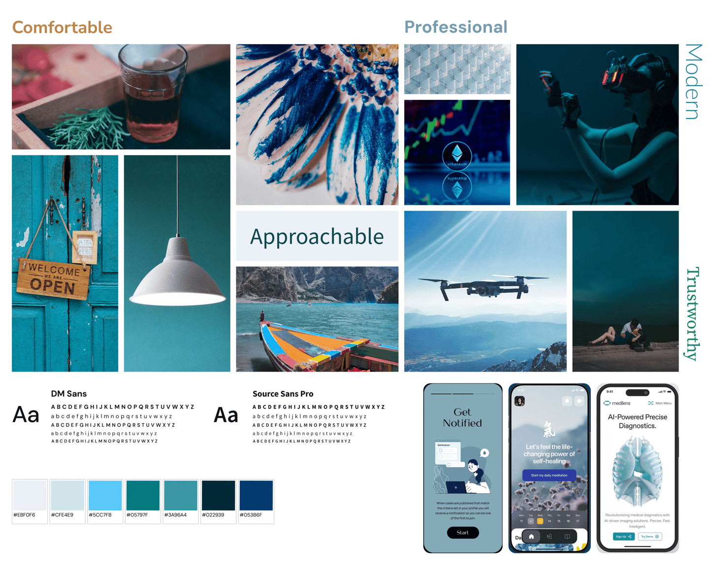
Exploring names that reflected clarity, warmth, and trust, I chose "Dwello"—inspired by “dwell,” symbolizing home. The added “o” gives it a modern, tech-forward feel, aligning with first-time buyers’ digital needs.
Name Selection
Logo and Word Mark Development


Logo Typeface
Josefin Sans has a clean geometric design that adds sleek professionalism to Dwello, balancing friendliness and sophistication, enhancing trust and credibility for first-time homebuyers.
Final Logo and Wordmark
Dwello as an application is designed to be a symbol of reliance, trustworthiness and safety for first-time home-buyers. When you look at the logo you can see how the "O" is been protected by the two Ls derived from the word Dwell, " which gives us the notion of what the brand stands for.

UI Library

Typography

Color Pallets
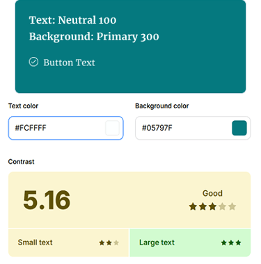
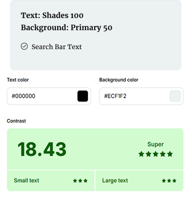
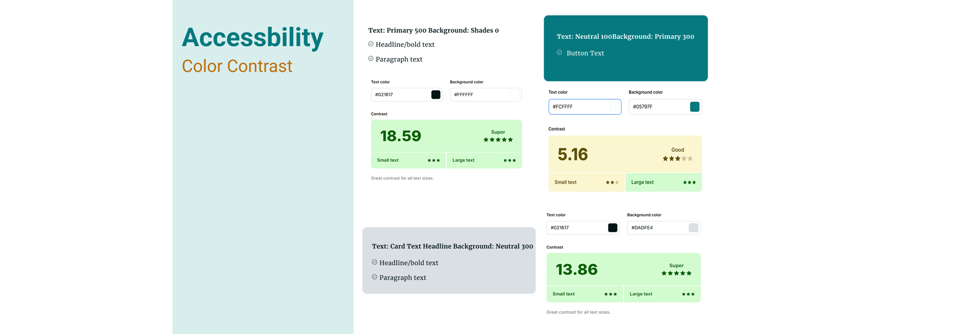
Accessibility

Atoms


Molecules


Cards
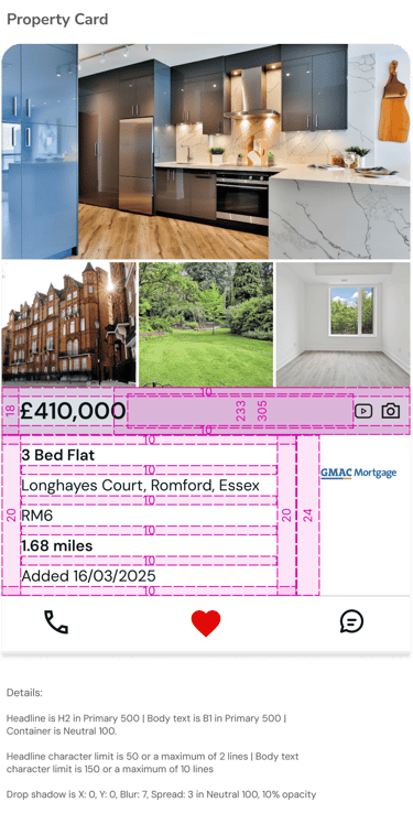

UI Library


Deliver
High Fidelity Prototype
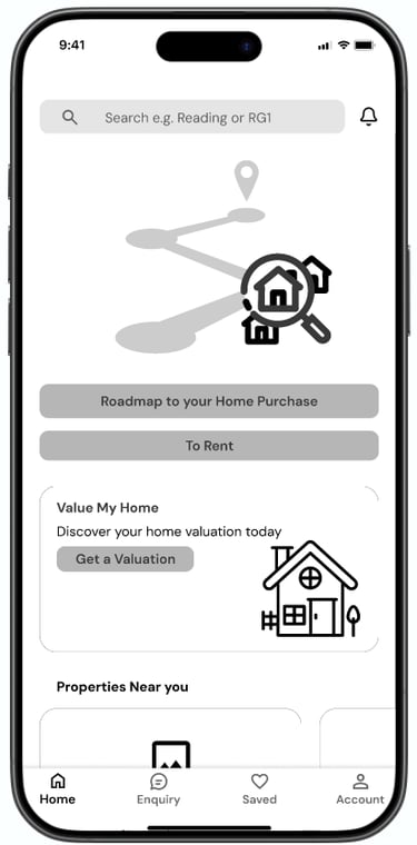
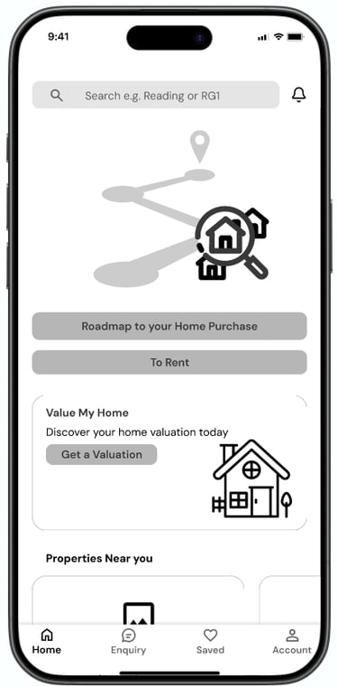
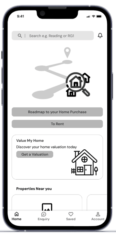
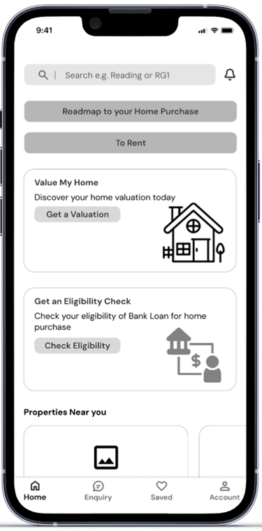
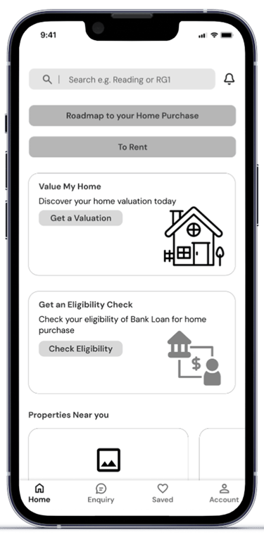
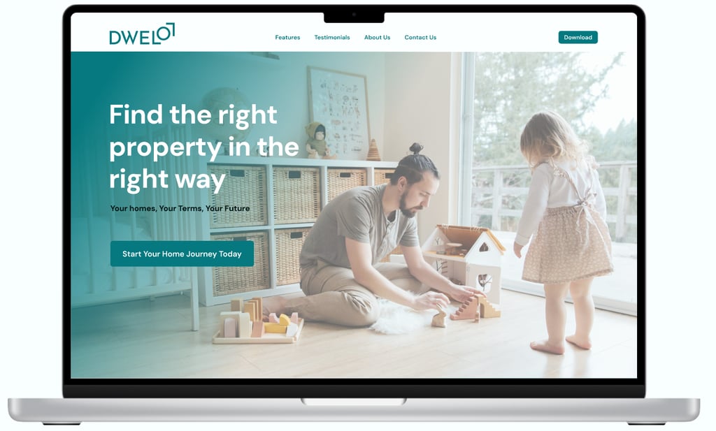
Here is the final prototype of Dwello, a real estate application designed to empower first-time homebuyers with clarity, confidence, and simplicity throughout their home-buying journey.
Authentic Eligibility Checker
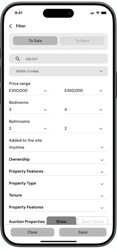
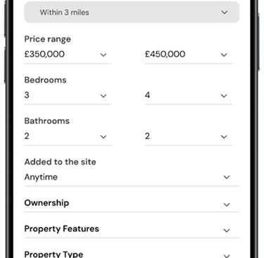
The Authentic Eligibility Checker helps users understand their true affordability and mortgage eligibility upfront. By inputting basic financial details, users receive accurate, personalized insights—eliminating guesswork and building confidence before they begin their property search.
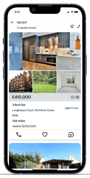

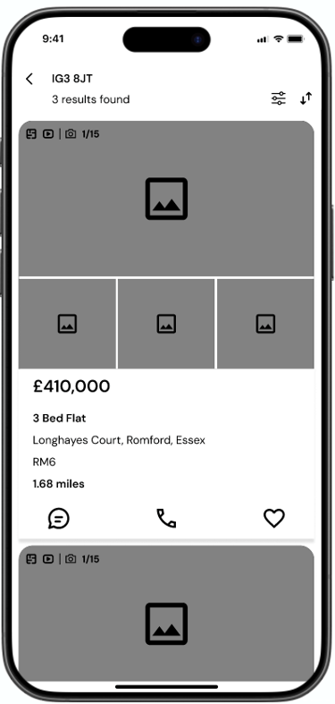
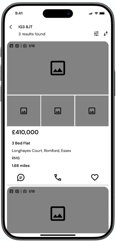
Personalized Property Listing
Based on the user’s eligibility check and loan budget, Dwello curates personalized property listings—ensuring users see homes within their financial reach, streamlining their search with relevance and confidence.
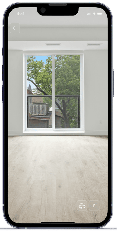
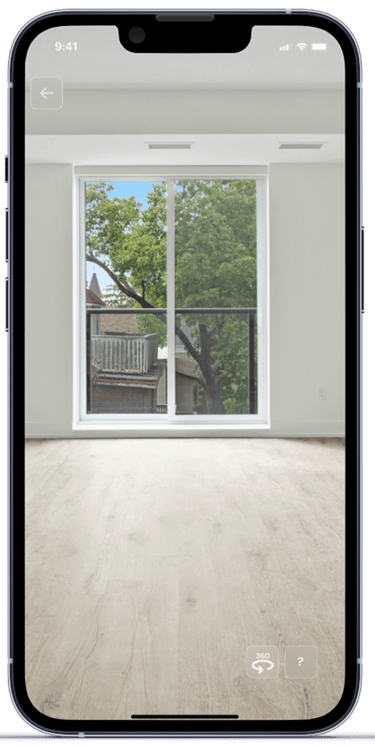
360 Degree Viewing
Dwello’s 360-degree viewing feature offers immersive virtual tours, allowing users to explore properties in detail from every angle—enhancing decision-making and bringing homes to life before an in-person visit.

Marketing Website

Key Takeaways
Asking the right question:
I realized that my initial research plan was too broad. Through this phase, I learned the importance of narrowing down the problem space and asking more focused questions.
Defining and developing narrative:
Grounding my user persona in real insights ensured every design decision was intentional and user-centered. This strong foundation clarified the "why" behind each feature, guiding a solution that was not only functional but genuinely meaningful to first-time homebuyers.
Test, Tweak, Triumph:
User testing uncovers real pain points early. Continuous iteration ensures that the product evolves with user needs, delivering clarity, usability, and lasting impact. Testing and iterating is a never-ending process.
More Projects
Let’s Work Together
Currently, I am looking for opportunities, please feel free to contact with me in the given email or phone number.
arafatgwu1311@gmail.com
info@arafat-khan.com
+447471526900